“CTA? More like CBA — am I right…?”
Sigh — no wonder our conversions aren’t where we want them to be. So how can we turn our sales from being “meh…” into “hell yeah!”? Well, the power lies in your CTAs.
Who would have thought that just a few words would be the deciding force between a sale and a customer bouncing? Your call-to-action is a call to arms, summoning your customers to reach into their wallet and yell, “Take my money!”

Building the perfect CTA is, in itself an art, and finding the perfect balance between subtlety and directness is something that many marketers struggle with. However, in this blog, we’ll show you 5 actionable steps to help you turn your CTAs from overlooked to irresistible.
Start here. Click this. Do that.
Your CTA copy should be so obvious that your visitors don’t even have to think twice. By using action-first language in your CTA such as “Buy Now”, “Learn More”, or “Find Out More”, you are giving the reader clear and direct instructions on what their next steps should be.
If you’re struggling with what to put down, think: what would Arnold Schwarzenegger say?
He’d yell from the top of his lungs, “Get to the chopper!”
Not a half-hearted “Er… there’s a chopper over there if you fancy it, mate — no pressure.”
Don’t Bury the Button:
You wouldn’t invite someone over for dinner and hand them the washing-up gloves (to be fair, it does need doing… oops, you missed a spot). So why make your website visitors work to find your CTA?
Your CTA should sit proudly above the fold — on a little golden throne, with a crown on its head, sceptre in hand.
The top of your website is prime real estate. Think Beverly Hills — that’s where your CTA wants to be, where attention is highest and hesitation is lowest.
So, don’t hide your CTA. Most people won’t bother looking for it.
Stand Out or Be Skipped!
You don’t want your CTA to be a wallflower. It should be walking into the club like Macklemore in the Thrift-Shop video, rocking a fur coat, “like what up!” — we’ll skip the next line… let’s keep this blog PG.
Use bold contrast, strong colours, and clear spacing to make it stand out.
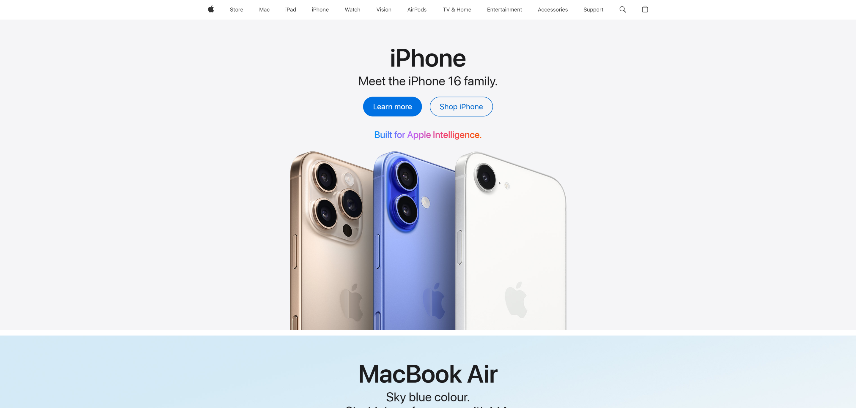
A perfect example of this is Apple’s homepage. Take a look at their “Learn more” button — it’s bright blue, bold, and unmissable. Right next to it is the “Shop iPhone” button, which is outlined but not filled. Both are visible, but it’s clear which action Apple wants you to take first.

You don’t need to give it a hi-vis jacket — it’s not applying for a job in scaffolding — but at the very least, make it pop!
Give Them Another Nudge!
Long pages = wandering attention. The longer your content, the easier it is for visitors to lose focus or forget what they were there for in the first place.
Think of your customers like you’re on a first date with the person of your dreams — while you may be infatuated with them, they don’t owe you any loyalty (yet).
So, when their eyes start to wander, remind them exactly why they showed up in the first place. Drop them your CTA again and show them your best side. You’re not love-bombing them — you’re just giving them that extra nudge they may need to stay on track.
Microcopy, Macro Trust
Like the saying goes: great things come in small packages. Being bold is nice and all, but as we mentioned before, balance is key.
Adding calming, low-pressure microcopy to your CTA like “Cancel Anytime” can help remove friction and build trust. It reassures your customers that they are in safe hands and softens the abrasiveness of the CTA.
You often spot this on subscription services like Netflix, but it works for any business.
If only my dentist had included a “Cancel Anytime” before I agreed to root-canal surgery… ouch!
______________________________
So, there you have it — five simple ways to take your CTAs from “meh” to money-maker.
Whether it’s shouting from the rooftops “Start here!”, maximising your website’s real estate, rocking a fur coat, giving that extra nudge, or building trust with a little microcopy — small changes can make a big difference.
Go on, give your CTAs the glow-up they deserve. Your conversion rate will thank you for it.
Need a fresh pair of eyes on your website or campaigns? Repeat Digital is offering Free Marketing Audits for businesses looking to improve their PPC, SEO & Paid Social strategies.
Our team of experts doesn’t just optimise campaigns, we provide ideas and solutions that drive real, measurable results. Clients love how we become an extension of their marketing team, which is why we’re rated 4.9/5 stars on reviews.io.
Find out how we can improve your marketing and maximise your ROI today.
Jump into another related resource
Whether you’re after expert-written blogs, downloadable guides, or time-saving checklists, our Resource Hub gives you practical tools to make your marketing more effective.


